How to Make Sales Report in excel | Sales Report Dashboard in Excel
If you want to create sales report with the sales database you have, just follow our steps to create sales report dashboard.
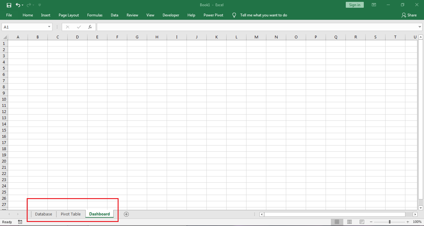
Step-1: Create Worksheets
First Create three sheets and name them as Database, Pivot Table, Dashboard.
Step-2: Create Database
Create or copy your sales database into the Database worksheet as shown in the image below.

Step-3: Create Pivot tables based on this database.
Team Wise Pivot Table
- First click a cell with the database and select the whole database with Ctrl+A or Ctrl+*
- Then go to Insert tab and click Pivot Table.
- Next click on Select a Table or Range option and in the range box the you can see the range for the database, make sure the range is correct.
- Then select Existing Worksheet option and click the pivot Table worksheet and select the cell A1
- Click OK.

- Then you will see a blank pivot table in the worksheet and pivot table field pane on the right hand side.
- In the pivot table pane you can see some field names like Date, Product, Salesman, Sales Team, Sales Area, Sales Amount.
- Drag the Sales Team filed into the Row box given below and Sales Amount filed in the Values box.
- Then you can see that pivot table will show summary of sales based on Sales Team.

Area Wise Pivot Table
Now we will create pivot table sales area wise but in different way.
- First select the Team wise pivot table and copy it.
- Then paste it on cell D1, we will get another pivot table. we will change this pivot table to get the sales summary based on area.
- Remove the Sales Team field from the Row box in the pivot table pane on the right hand side and drag the Sales Area field form the above to the Row box.
- Now you can see the sales summary based on sales area.

Salesman Wise Pivot Table
Now we will create pivot table Salesman wise in same way.
- First select the Sales Area pivot table and copy it.
- Then paste it on cell G1, we will get another pivot table. we will change this pivot table to get the sales summary based on salesman.
- Remove the Sales Area field from the Row box in the pivot table pane on the right hand side and drag the Salesman field form the above to the Row box.
- Now you can see the sales summary based on Salesman.

Now here we will get the top 10 salesman based on sales amount. So click on the arrow in the Row Label header and go to Value Filter and then click on Top 10

Then you will get a dialog box as show below.

Here you can take top 10 or top 5 anything you want then click OK. Then you will see the pivot table as shown below:

Product Wise Pivot Table
Now we will create pivot table Product wise in same way.
- First select the Salesman Area pivot table and copy it.
- Then paste it on cell J1, we will get another pivot table. we will change this pivot table to get the sales summary based on product.
- Remove the Salesman field from the Row box in the pivot table pane on the right hand side and drag the Product field form the above to the Row box.
- Now you can see the sales summary based on Product.

Now here we will get the top 10 product based on sales amount. So click on the arrow in the Row Label header and go to Value Filter and then click on Top 10

Then you will get a dialog box as show below.
Here you can take top 10 or top 5 anything you want then click OK. Then you will see the pivot table as shown below:

Step-4: Create Charts based on the Pivot Tables.
Create Chart based on Sales Team Pivot Table
- First select the Sales Team pivot table.
- Go to Insert tab. Click Chart dialog box opener.
- Select chart type as Bar.
- Click OK.

You will get a chart as shown below:

Now we will remove the chart buttons marked in above image. Right click on any highlited field button and select Hide All Filed Buttons on Chart

To Remove Legends on the chart. Click on the + sign on the right hand side of the chart and Uncheck Legend.

Now change the Chart Title. Remove the title Total and type Team Wise.
Then we have to change the chart design. Select the chart and and click on Design Tab then select the design as show below.

Now change the color of the bar of the chart. Click on any bar then go to Format tab then click the arrow button of pre-designed shape style and select a style as shown below.


Chart in Dashboard sheet.

Create Chart based on Sales Area Pivot Table
- First select the Sales Area
pivot table. - Go to Insert tab. Click Chart dialog box opener.
- Select chart type as Bar.
- Click OK.

The rest is same as we have done for Team Wise chart. Then move it to Dashboard sheet.
Create Chart based on Salesman Pivot Table
- First select the Salesman pivot table.
- Then sort the data by sales amount.

- Go to Insert tab. Click Chart dialog box opener.
- Select chart type as Bar.
- Click OK.

The rest is same as we have done for Team Wise chart. Then move it to Dashboard sheet.
Create Chart based on Product Pivot Table
- First select the Product Area pivot table.
- Then sort the data by sales amount.

- Go to Insert tab. Click Chart dialog box opener.
- Select chart type as Bar.
- Click OK.

The rest is same as we have done for Team Wise chart. Then move it to Dashboard sheet.
Now resize the chart in the dashboard sheet and arrange them as shown below.

Step-4: Create Charts Slicer for Charts.
Now we will create the Chart Slicer and Chart Timeline Slicer so that we can change the chart data according to our requirements.
To get the slicer, go to Analyze tab, Click on Insert Slicer then select Product, Sales Team and Sales Area.

To get the Timeline Slicer, go to Analyze tab and click Insert Timeline Slicer and select Date.

Now change the style of the slicer. Select first three the slicer, Go to Options then in Slicer Style group select Light Green, Slicer Style dark 6.
Now select Timeline Slicer and o to Options then in Slicer Style group select Light Green, Slicer Style dark 6.
Finally arrange the slicer on the left side of the charts as shown below.

Step-4: Create tables to show top 10 Salesman and top 10 product
First decrease the width of column P so that it looks like a separator. Then create a table for top 10 salesman.
- In Q2 type Top 10 Salesman.
- Select Q2:Q12 and go to Insert tab and click Table.
- Create Table dialog box appears, click on My table has header and click OK.
- Then go to Design tab and click Green, Table Style Medium 21 in Style group.
Then create Top 10 Product
- In Q19 type Top 10 Product.
- Select Q19:Q29 and go to Insert tab and click Table.
- Create Table dialog box appears, click on My table has header and click OK.
- Then go to Design tab and click Green, Table Style Medium 21 in Style group.
Tables will show as follows:

Now we will get data into the table. So click on cell Q3 and type
=IF('Pivot Table'!G4="Grand Total","",IF('Pivot Table'!G4="","",'Pivot Table'!G4))
then drag the formula till the end of the table.
Again click on cell Q20 and type
=IF('Pivot Table'!J4="Grand Total","",IF('Pivot Table'!J4="","",'Pivot Table'!J4))
then drag the formula till the end of the table.
(N.B: "Pivot Table" in the formula is the name of sheet)
Finally you can change the formatting of every object so that it fits and looks good into your screen.
And your Sales Report is ready to use.
********************************* ~:Support Our Work Financially:~ *********************************
Project File Type: Free
If you think this tutorial helps you to solve your problem and add value to your work, Buy me a Coffee..
************************************************************************************************


0 Comments